Revitalizing an Established Brand
Designing a new website across desktop & mobile for Hartford Associates* with design agency Someoddpilot.
*Alias client named used per client’s request
The Challenge:
Hartford is a B2B retail solutions company with 45 years of experience in helping clients stand out across Ecommerce and Brick & Mortar. Although they’re based in Chicago, they are a national company with 7 offices near key retail headquarters across the US.
With the market for recruiting new clients becoming increasingly digital, Hartford wanted to revitalize their website to more effectively communicate their many offerings as well as highlight their constantly evolving industry expertise.
Chicago design agency Someoddpilot was brought on to design and develop this new website, and I was in turn hired to design the wireframes.
Team:
Collaborating with the Someoddpilot team, I worked with company strategists, a copywriter, developer, and lead designer to ensure my wireframe designs were implementable as well as consistent with company standards.
My Roles and Responsibilities:
Desktop and mobile wireframe design, information architecture, research synthesis, and presenting designs in client meetings.
Tools Used:
Sketch
InVision
Discovery
Lacking a clear structure to their dense list of services and company information, Hartford’s old website struggled to effectively communicate their expertise. The first step in the redesign was to organize these components in a way that was logical to not only their business but also to their users.
As a B2B brand placement and marketing company, Hartford’s users are primarily mid-level employees scouting retail solution services for their businesses. To guide their search, service offerings were condensed and organized into three categories:
eCommerce for all online and digital services
Brick & Mortar for all physical product management and optimization services
Insights & Technology for their proprietary marketing and analytics software-related services
New Sitemap
Sketching
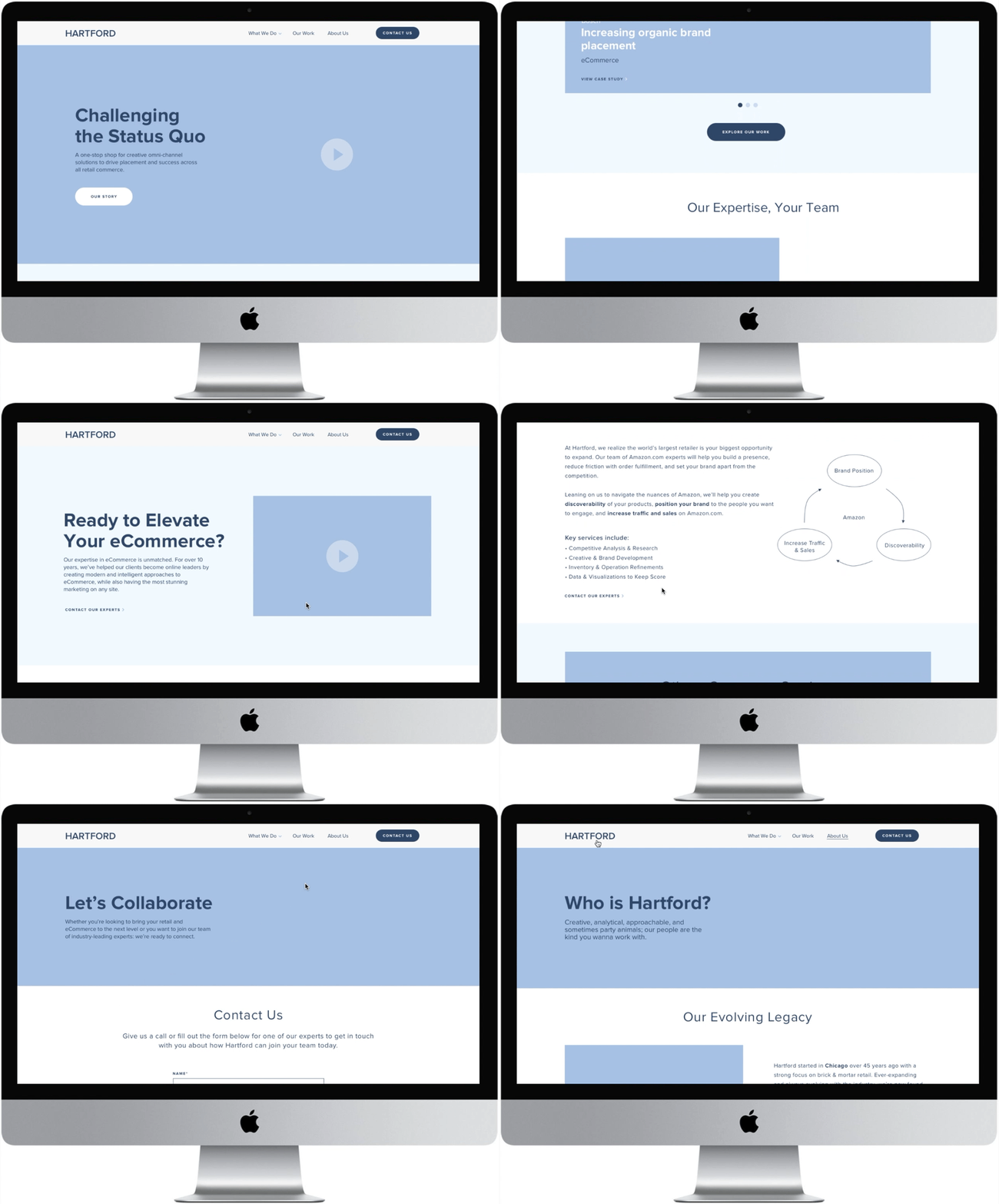
Wanting to first improve user experience through a clearer overview of Hartford’s offerings and story, I began ideating with information architecture as a priority. With users wanting immediate answers to “What We Do” and “Who We Are,” I designed the homepage to include:
Clear, omnipresent navigation
A large introductory video to make a strong visual impression
A high ranking case study module to showcase services in relatable applications
Succinctly communicated services with space for images to keep the page scannable
Client testimonials and logos of key retail partners to display industry credibility
A contact module built into the footer so users could reach out at any step of their journey through the site
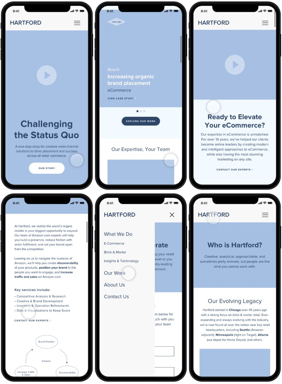
Having access to Hartford’s in-depth service documents, I actively organized information to be scannable on mobile devices as well as desktop.
Wireframes
Seeking to align intuitive navigation with customer acquisition, I designed each step of the users’ journey to gradually ease into the finer details of Hartford’s services.
Users would first be introduced to each service category while exploring the homepage, with a Learn More CTA leading to a specified detail page with more information.
Home
What We Do Landing
If a user travels directly to the What We Do page through the top navigation, they’re brought to a landing page that provides slightly more in-depth information per sector via:
A large animated introductory video
Five sub-services with brief descriptions
Logos of key retail partners to boost credibility
A Learn More link leading to the respective detail page
I established a visual hierarchy through different text weights to help guide users without overwhelming them.
Following the previous page’s CTAs or the drop-down menu in the top navigation, users are presented the full descriptive details of each of Hartford’s sub-services. Through continued visual hierarchy, bullet-pointed services, and simple diagrams rather than stock images, the potentially complex page is kept scannable.
With the end goal of users contacting Hartford directly, I additionally included a Contact Our Experts CTA within each sub-service section.
Service Detail Page
Iterations
With the service detail pages being the heaviest in terms of content, I experimented with several different structures to present the information as concisely as possible. After feeling as though a drop-down list was too text-heavy and a tab structure was too confusing, I collaborated with our copywriter to develop a conversational tone to keep the copy minimal and scannable.
Version 1
Version 2
Final Version
Company Pages
To continue the scannable yet detail-oriented tone of the services pages, I created full-width banners with quick overview stats to be utilized on the About Us page. These banners allowed space for exciting visuals to incorporate company values and culture to break up the copy.
Additionally, in wanting to position Hartford as a group that collaborates with their clients’ teams rather than being an outside consultant, I utilized the established conversational tone to merge their professionalism with their fun, collaborative culture.
About Us Page
Prototype
Though the prototype links have since been removed, you can view a brief video preview across desktop/mobile here.


